
I've used my online portfolio as an excuse to tinker with web design for several years, before doing web design as my day job. I put up my first art site in 2005 under the domain cynthiarimmer.com (my maiden name). Unfortunately there was a random DNS error coupled with a hard drive crash, and the site was only up a mere three weeks before plunging into web limbo. If I remember correctly, the layout was mostly greys with some curly-cues around the edges (to cover for the fact that I didn't have much work to show yet). Despite the design blunders, the real issue it had was that it was trying to accomplish too much. There was a separate page for illustration, design, photography, and music (don't ask). People would ask, "so, what is it you do, exactly?"
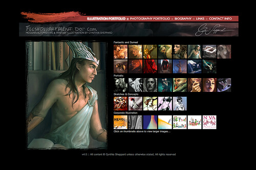
Moving right along to 2006, I designed the first illustration website I wasn't embarrassed to show anyone, mostly. I had only done a couple of table sites at this point, using what was popular in band sites at the time as my guide... remember the days of teeny tiny websites that floated in the center of a black page. Yes, that.
Well, for the first time I had what seemed like enough art to call a portfolio, however no one could find what they were looking for with the little 50x50 px icons. We live and learn.
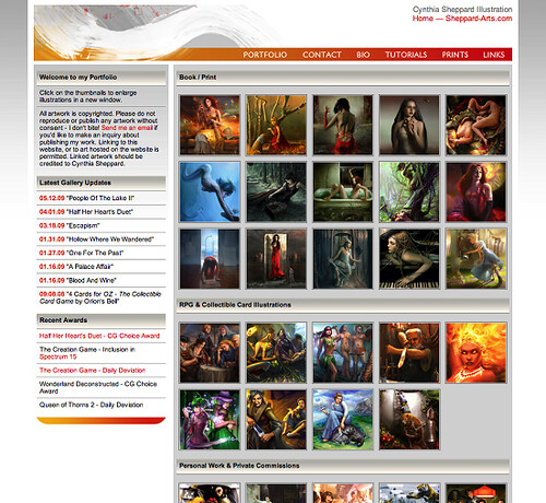
Next up is the site I put live January 1, 2008, which is what I've used to represent my art on the web until earlier this afternoon.
While definitely stronger than the 2006 iteration, I've always felt it was a little too much. Too wordy all over, for starters. I realized I don't need a bio, so much as I need a PR statement. If people are interested in my life story, they can read my blog, but most people visit a portfolio site to look at the portfolio. Also it was a royal pain to update without a CMS.
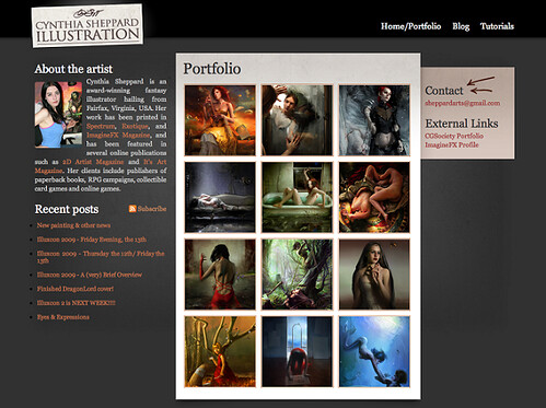
And finally, we have the new 2010 edition of Sheppard-Arts.com! I always tell people web design is an organic process, as websites grow and change over time. So for 2010 I lumped together all my knowledge from my design job, my former art sites, and advice from art directors and artists, and came up with a very clean, simple layout that will hopefully do what I need it to do.
My portfolio hadn't been pruned since 2007, so I did get rid of a lot of older work (maybe a bit too much, but I'll start here). My ideology is that an online portfolio should reflect the leather book you showing to people at reviews. Blogs and external portfolio sites are a great dumping ground for everything you've ever done, and your portfolio site should reflect your best work.
Another thing this site doesn't have that the last one did is a place to buy prints of my work. People did sometimes contact me about prints, but everyone seemed to want custom sizes or surfaces, so offering up the standard sizes ended up being more of a hassle than it was worth.
I'm keeping the tutorials section in hopes of adding to it over time, and because enough people have told me it's a useful resource. The blog feed is now condensed into titles in the lefthand column, but there's also a link to my physical blog in the main navigation, and an RSS subscription button for the google reader types.
I'm very curious to see how this new site performs over the last one, because I'll undoubtedly want to upgrade it again before long.
Looks awesome Cyn! You did a great job :0
ReplyDelete