Thursday, December 15, 2011

New Cover Art, Isle of the Unknown

I just found a great image on the LotFP Blog of my latest wraparound cover for their new title Isle of the Unknown:


Image by LotFP

Click to enlarge:


This piece presented some special challenges, including painting a harp made out of rainbow colored light. It's also possibly also the most colorful image I've ever done (since 2008 at least, when I was going through a rainbow phase), which made it especially fun. If you're an RPG gamer, check out some of the discussion about the game, and enjoy.

Tuesday, December 13, 2011

Mourning the End of Google Wave


(Image by me)

Perhaps it's a bit premature, but before I send Google a pleading letter in an envelope sealed with my tears, I wanted to take a minute to aimlessly rant about lament the imminent demise of Google Wave on my blog. For almost exactly two years, Wave has been the primary way that my artist pals and I collaborate, share work for critique, and talk to each other. And considering that I spend most of my social life online with my artist pals, that's pretty significant.

Alas, dearest Wave, your time is about to end at the end of January 2012, and my pals and I are in search of alternatives to you, but will it ever be quite the same? Think of all the good times we had. I will miss you.

Thursday, December 8, 2011

Taking The Plunge: Full Time Freelance pt. 1

Taking the Plunge

It's been just over a month since I resigned from my day job to pursue illustration full time, and I'm still alive! Actually, if someone had told me two years ago that there would come a day I'd wake up and think, "What should I paint today... Magic or Star Wars?" I'd have made them pinch me to make sure I wasn't dreaming... or dead.

Of course, the biggest worry about switching from a well-paid full time office job to freelance illustration was money. That's why I hesitated for so long, and I think that's what artists fear the most about the transition. For me personally, having the extra time has been well worth it. I'm seeing a vast improvement in the quality of my artwork so far. Even better, I've been able to take on more work, which is helping to close the financial gap a little bit. Going on a budget is never fun or easy, but I'd prefer to give up some luxuries and turn the heat down a few degrees than continue to kill myself working two jobs. Period. And hey, I'm saving on gas money by not spending 2 hours in traffic every day. ;)

The biggest day-to-day challenge so far has been keeping track of what day/time it is, so I've been relying on my calendars and digital alarms a lot more. December has turned into a very busy month- so busy that I couldn't have handled all the art orders on evenings and weekends alone. But I'm working at a comfortable fast pace, and in the extra time between assignments I've been able to start some personal work, and do things I've neglected for a long time (like updating my blog!)

Wednesday, December 7, 2011

Don't miss the Season Finale of Awesome Horse Studios!


Come join me and my fabulous cohorts for Episode 10 -the season finale- of Awesome Horse Studios, this Saturday, December 10th at 1:00 PM EST! All season long we've been doing live demos and critiques, and on this 3-hour long special, we'll be talking character costume design, and having a critique frenzy. Be sure to bookmark our Livestream Channel, where we broadcast every week.

Click here to view the Facebook Event, and come say hi!

Sunday, December 4, 2011

Awesome Horse Drinking Game v.1.0

Sometimes during the show, people ask us if we paint from our imagination (without using references). The answer is "yes" but, as you can see below with my ridiculous horse painting, sometimes it's to a frightening end...


I'm sure the rules will change over time, so keep an eye out. If you haven't caught one of our shows yet, visit http://www.awesomehorsestudios.com for our show schedule and to download past episodes.

(Oh, and please participate responsibly, or don't, lest ye pickle yer liver!)

Sunday, November 20, 2011

Color Mixing from the Masters

I don't use this technique for every oil painting, but if you're feeling lost on what hues to use, sampling from a master work can help guide your color choices.

In 2010, when I was working on Beautiful Grim, my inspiration was John Singer Sargent's Lady Agnew of Lochnaw. I was privileged to see it at the National Gallery of Art in DC about a decade ago, and it's been one of my favorites by J.S.S. since. So while I let Lady Agnew set the mood for my piece, I also let it direct some of my color choices, particularly the skin tones.


No digital reproduction will ever be accurate to an original, but I was able to use colors sampled from Lady Agnew to create a skin palette that had a similar value range and close hues. By printing out the sampled colors on a card using a calibrated photo printer and photo paper, I'm able to easily mix paints next to the cards:


Thursday, November 10, 2011

Awesome Horse Interviews from IlluXCon 2011

It goes without saying that I had a great time at IlluXCon. :)

Instead of blogging at length about the experience, you should check out our video broadcast from the convention; Me and the Awesome Horse guys sat down for an informal interview with a dozen talented folks at the convention, including exhibiting artists, art directors, and even the creators of IlluXCon, Pat and Jeannie Wilshire!

Alternate title: Two Hours on a Bed at the Ramada


Visit http://www.awesomehorsestudios.com for more videos. Live demos and critiques every week (and the occasional interview special).

Saturday, October 15, 2011

Medusa: work in progress

With IlluXCon just around the corner, I can't help but feel like I haven't done enough traditional work this year (can you ever do too much?). So I'm making it a point to pack as much oil into October as I can, starting with this personal work-in-progress, of Medusa and her stony companion.

Start of the acrylic underpainting:


More progress, with my furry studio mate:

Saturday, October 8, 2011

Live Webcast Saturday Oct. 8 at 12PM EST

In just 25 minutes, I'll be doing a live broadcast with my talented colleagues Marc Scheff, Noah Bradley, and Aaron Miller

Together, under the banner of Awesome Horse Studios (someday we'll talk about the story behind that name, heh) we will be broadcasting art demos on a wide variety of topics. Today's episode features Noah Bradley painting, and the rest of us answering audience questions live - come interact with us at http://www.livestream.com/awesomehorsestudios from 12 PM EST - 2 PM EST.

Monday, September 26, 2011

Magic Card Art: Zombie Token


Card Name: Zombie Token [Innistrad]
© 2011 Wizards of the Coast

Gatherer Link: none

Medium: Digital
Original Art Available? No
Artist Proofs Available? No

Artist Notes: Technically my earliest commission for Magic, though I finished the art after Bloodcrazed Neonate in the same commission cycle. I've heard a lot of positive feedback at events about this token, for the convincing deadness of the eyes, and/or the overall creepiness- thanks very much!

Saturday, September 24, 2011

Magic Card Art: Bloodcrazed Neonate


Card Name: Bloodcrazed Neonate
© 2011 Wizards of the Coast

Gatherer Link: http://gatherer.wizards.com/Pages/Card/Details.aspx?multiverseid=220373

Medium: Digital
Original Art Available? No
Artist Proofs Available? Yes (very few)

Artist Notes: This was technically my first Magic commission from Wizards, though my Zombie Token came first numerically. I had a lot of vampire/dark work in my portfolio, and it was very fortunate timing for me that the art director saw it right as they were starting to commission work for Innistrad, the "goth" set.

Also as seen on my favorite Tumblr, Magic Cards With Googly Eyes! http://magiccardswithgooglyeyes.tumblr.com/search/bloodcrazed+neonate

Saturday, September 10, 2011

B&W Interior Illustrations for Kobold Quarterly

I received my copy of Red Eye of Azathoth from Kobold Quarterly, with five black & white interiors I did back in the Spring.


Click for a larger version:
Illustrations for Kobold Quarterly

Tuesday, June 21, 2011

Lessons from the 2011 Illustration Master Class

The week-long Illustration Master Class came and went; While I was there it felt like maybe I'd always been there, but after arriving home and readjusting to daily life it seems almost like a dream.


For those of you who haven't heard of or experienced the wondrous event known as IMC, the basic concept is this: Take a group of hungry and dedicated fantasy illustrators, put them in a beautiful college campus environment with a dozen or so of the world's top working talent acting as faculty, stir for a week until magic happens. Between working on our paintings, watching incredible lectures, and surprise faculty demos, we all came together and celebrated the sense of family and community fantasy illustrators have, that I've mentioned many times.

Of the countless memories and information I'll take away from the experience, here's my top 5 list of lessons from IMC:

1. Good planning makes good paintings. Instead of doing 5 thumbnail sketches, make 50. Instead of shooting 10 reference photos, shoot 100. Doing more work in the planning stages will force you to think through all the challenges you'll face when painting, and come up with solutions before you start laying paint down.

2. Be meticulous about your reference photos. While I was modeling for another student's piece, faculty member Dan Dos Santos readjusted a light under my arm four times, for about 20 minutes, just to give the student exactly what her piece needed. You should take the same care when shooting. It's worth it to use the best equipment you can afford, to set up your lighting as close to what you want in your final image as you can, and to get models who understand your vision. Many of the faculty cited "getting great models" as a part of the success of their figurative work.

3. Copying Old Masters' paintings is a good way to build your painting skills. It might seem like a waste of time to stop what you're doing and reproduce an existing painting. After all, you won't get a portfolio piece out of a copy. But the exercise can affect the way you think about making your brushstrokes, blending and choosing your colors in your own art.

4. Practice constantly, but don't just practice what you know constantly. Your brain only builds new neural pathways through challenging practice, not repetition alone. If you do the same painting 50 times, you'll only improve at creating that one painting, so go a little bit outside your comfort zone when you can.

5. Make art for you. This was one of the hardest-hitting lessons at IMC for me. Find a way to inject something you love into every painting, whether it's an assignment with a strict style guide or a personal piece. If you're not sure, go through your portfolio and look at common themes you've chosen. Doing so will make it almost impossible to burn out on painting.

Tuesday, May 10, 2011

Mirror Maze Cover

Fun! I recently learned that Mirror Maze by Michaele Jordan is now available for pre-order on Amazon. Earlier this year I collaborated with Michaele and art director extraordinaire Lou Anders of Pyr Books to create this painting for the cover:


Early concept sketches:


Mirror Maze is the dark tale of Jacob Aldridge, who finds himself affected by a curse that runs in his family. Read the full synopsis and information about the author.

Saturday, April 30, 2011

A Sketch from my Family Vacation

I took the week off (a rare occasion) and my husband and I went out to Estherville, IA to visit 96-year-old Grandma Sheppard for Easter, because we rarely get to see her, and it's important to let her know we're thinking of her. She's sweet as can be for someone that's been alive since 1915, though her short term memory is very bad. By the time we landed back in Washington, DC, we knew she'd probably forgotten we visited.

But, thankfully, while we were there we had the brilliant idea of getting her engaged in a little painting, to challenge her mind, and so that she'd have some proof of our existence. My husband got her a small acrylic set on her 92nd birthday, but she forgets she has it, so she doesn't use it. Not the case this week.


So when we talk to her on the phone we can ask, "hey, is there a landscape with the pine trees on your wall?" And she replies "Oh, yes! Did I paint that?"


You sure did, Grandma.

Sunday, April 17, 2011

Transferring a Digital Drawing to Illustration Board

When I start an oil painting by sketching it digitally, I go through a process of transferring the digital image to the traditional surface. There are a few ways to accomplish this task; Some artists use a large format printer and mount the prints to a work surface, some people use a projector or light box, and some people (including a younger version of me) use the laborious grid method. There really isn't a wrong way to do it, but I prefer the very easy graphite transfer method, which I'll explain.

A quick note about my tools: For an oil work surface I most commonly I use Strathmore 500 Series illustration board. It's got a great smooth surface like masonite or sanded wood, but is easier to find at my local art store on short notice and lighter weight for easier framing and transport. The other items I use for this process are my printer, a 7B pencil, an HB pencil, and some acrylic matte medium.


Once I have the finished digital drawing the way I like it, I print it out; when my printer is smaller than my work surface, I print the drawing out in several pieces and reassemble it with clear tape. I work these drawings up at high resolution (450 dpi) at their actual size, so I have lots of detail in the prints.


Once the drawing is printed out and reassembled, I take a soft 7B pencil and make a light coating of graphite all over the back of the printed drawing. when I trace over the front side with a harder HB pencil, the graphite will be lightly transferred onto my work surface. If you're a little less cheap than I am, you can also use transfer paper which is sold in rolls or pads.


Typically the light traced lines by themselves feel a bit stiff or aren't dark enough, so I'll use my HB pencil to draw over the transferred image in areas I think need more emphasis or definition.

Lastly, since the illustration board by itself would absorb the oil in the paint and eventually degrade, I seal the surface with 3-4 coats of acrylic matte medium after the drawing is transferred. This helps keep the illustration board intact and seals the graphite drawing.

Friday, March 11, 2011

My Art Studio Workspace

Update, August 2012: Since this post was made, I've taken some new photos and posted them here. Carry on!

-----------------------------------

A few of my friends have made posts like this about their workspaces, so I figured I'd jump on the bandwagon.


(click to enlarge and view description)

An artists' studio is always evolving. I think back to 5 years ago when I worked in a huge loft space above a nightclub, and how much has changed since then. I've sacrificed a lot of floor space over the last couple studio iterations, but ended up with better equipment, so in many ways it's a fair trade. My next missions for my current studio are to get a better flex-arm light for my easel and a second bookcase that can support my overflowing art book and magazine collection.

Tuesday, March 1, 2011

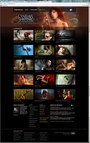
Website Updates and Thoughts on Branding

2011-sheppard-arts

Sheppard-arts.com has received its yearly facelift for 2011, including a new mobile version for those of you who are bound by the confines of the modern smartphone.

I spent a little more time planning out this year's revisions than last, and more time thinking of myself as a brand. Some new features include:

-An official Cynthia Sheppard Illustration logo.

It's high time I had a single image that I can carry across all my promo items. I was inspired by some of my cohorts such as Sam Flegal who established his "Strange like Sam Flegal" brand last year.

-Bigger thumbnails.
1. I got a lot of comments like "make the thumbnails bigger!" hehe.
2. I still opt for a lightbox image viewer over a slideshow or full-page-scroll format because the proportions of my images are all different, so they look disorganized or don't read/resize well in a fixed window. One AD mentioned that using a lightbox can be cumbersome, especially if the window overlay doesn't allow you to right-click/save the pictures. So to make his life easier I chose a version that does allow people to save, and increased the thumbnail sizes so he and other ADs can better jog their memory of what a painting looked like without having to click on anything.

-A dropdown menu for external links/social media and to share the site on facebook.
I'll probably add some more sharing-via-social-media options later, but I want to test Facebook first to see what kind of traffic is generated.

-The removal of unnecessary sections.
My painting tutorials will still be available, but since I rarely had time to update them, having a whole page dedicated to them was dead weight. The majority of people that come to the site are there to see the artwork or to find out how to contact me, so I also nixed the Resume section in favor of a small and tidy client list on the homepage.

Enjoy!